The Unmade is a personal, fictional news website project inspired by major traditional media outlets.
My goal was to create a modern, readable, and fluid news platform that offers a comfortable and intuitive user experience.
After reviewing major French and English / American news websites, one key observation stands out:
French news sites tend to be very dense, overloaded with information, which results in a less pleasant user experience.
In contrast, U.S. news websites (such as The Washington Post or The New York Times) share similar design principles: they are more structured, less cluttered, and offer a cleaner, more comfortable user experience.
This makes them a strong source of inspiration, particularly regarding overall layout and content structure.
The prototypes were designed in Figma, and the website was built using WordPress with the Bricks Builder theme.
Visit the website: nicolasmassot.com/the-unmade/
Design process
Header

Desktop / Top of the page
On the left side, the presence of a “mobile-style” menu icon (even on the desktop version) is an increasingly common and effective pattern.
It ensures that navigation is always accessible, regardless of where the user is on the site, improving usability at virtually no cost.
The layout features a centered logo, with a navigation bar positioned below it.
The main (parent) categories are displayed horizontally from left to right, followed by a visual separator.
The subcategories are then arranged vertically, from top to bottom.
This intentional change in reading direction helps break the monotony of a purely horizontal structure and improves visual clarity.
On the right side, a toggle button allows users to switch between dark mode and light mode.

Scrolled state (mobile and desktop)
When the user scrolls (whether on desktop or on mobile display), a compact header appears.
This persistent header remains visible across the entire site and includes the mobile menu access on the left, a smaller logo in the center allowing users to return to the homepage and the dark mode / light mode toggle on the right
Keeping this header constantly available ensures seamless navigation and quick access to essential controls at all times.
Footer

Desktop and mobile versions
The footer is designed to be lightweight and discreet, avoiding information overload.
Of course, its content should be adapted based on the specific needs and goals of the project.
Homepage desktop
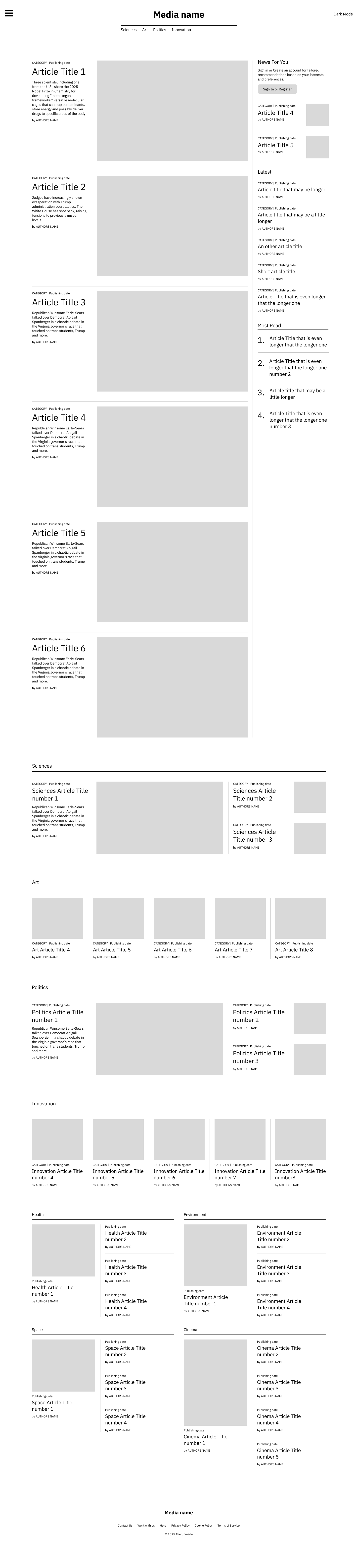
Section 1
Two-thirds of the section is dedicated to the front page articles.
The remaining one-third is reserved for a “News for You” area, featuring a call-to-action that encourages users to log in, along with personalized article recommendations based on their preferences.
A “Latest Articles” block follows – a classic and effective pattern that displays the most recently published content regardless of performance metrics.
Finally, a “Most Read This Month” ranking highlights the platform’s most popular articles, reinforcing engagement by surfacing proven high-interest content.
Section 2
This section presents the main content categories using an alternating layout pattern.
For one category, the layout features one large article occupying two-thirds of the width, alongside two smaller articles stacked within the remaining one-third.
The following category is displayed with a horizontal row of five articles presented from left to right.
These category sections showcase the most recently published content from each parent category, while deliberately excluding articles already displayed in Section 1, in order to avoid repetition and maximize content variety.
Section 3
This section displays all subcategories in a balanced 50/50 layout, allowing for the introduction of additional content while preserving a clean, readable, and well-organized structure.
Standard article layout
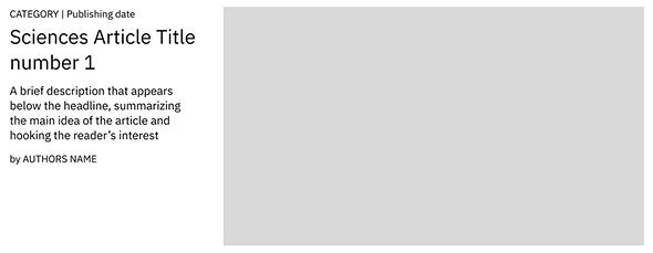
Each article follows a consistent structure:
– The category name (omitted when viewing a subcategory page) and the publication date
– The article title displayed prominently for maximum readability
– A short description when using the “large” article format (omitted for smaller layouts)
– The author’s name
– The article’s featured image
As with the rest of the interface, the priority is to maintain a layout that is clean, readable, and well-organized. The same article layout is used consistently across the entire site, helping users quickly become familiar with the interface and navigate content more comfortably.
Homepage mobile
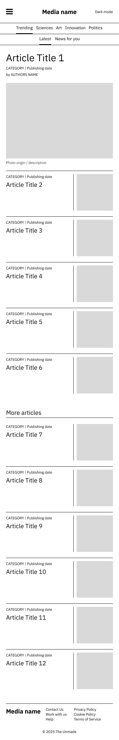
Mobile layout
The mobile experience adopts a layout that is completely different from the desktop version.
Content is organized using a tab-based interface, with tabs for both main categories and subcategories.
Navigation is smoother and more fluid, with no full page reloads, allowing faster access to different sections of the site and significantly improving the browsing experience on mobile devices.
Articles are displayed in a clean, mobile-optimized format: category and subcategory, followed by the publication date, the article title, the author name is intentionally omitted to avoid overcrowding the interface and to improve readability on smaller screens, and the article image is positioned on the right.
The main tab (Trending / Latest) features one highlighted “lead” article that corresponds to the main front-page feature.
All other tabs follow the same standard layout, without a highlighted article.
There is no traditional pagination; instead, articles are continuously loaded as the user scrolls, creating a seamless and modern browsing experience.
Category and subcategory pages desktop
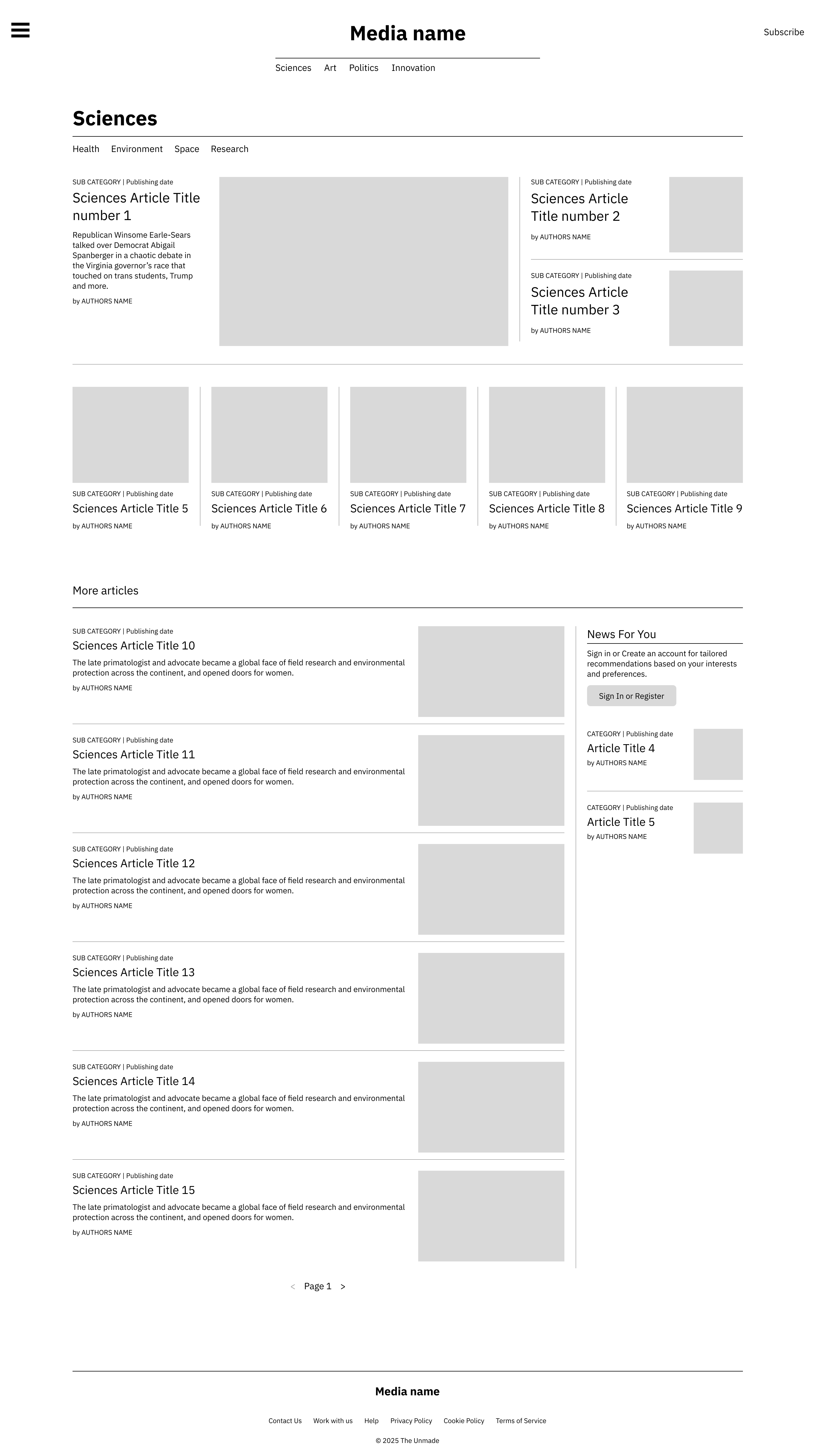
Section 1
The section displays the category name prominently, along with access to subcategories when viewing a parent category. For subcategory pages, the category header is omitted to simplify the user flow.
The layout follows the first main category display pattern from the homepage: one large featured article alongside two smaller articles.
If the section represents a parent category, the layout continues with the homepage’s second main category pattern: a horizontal row of five articles, to showcase a broader range of content.
For subcategories, these additional five articles are omitted, focusing on a smaller, more precise set of articles.
Section 2 – “More Articles”
This section occupies two-thirds of the layout and features a paginated list (6 articles per page) of all articles within the selected category or subcategory, effectively providing access to the site’s complete content.
The article display follows the same style as Section 1 on the homepage: clear, orderly, and stacked vertically from newest to oldest. On this page, the layout is slightly more elongated and less centered, optimizing readability for longer lists of articles.
The remaining one-third is dedicated to a “News for You” block, identical to Section 1 on the homepage. It includes a call-to-action encouraging users to create an account or log in, along with personalized article recommendations based on the user’s preferences.
Category and subcategory pages mobile
Mobile version of category pages
Although the homepage features all articles in a tabbed layout, category-specific pages remain accessible via the mobile menu and therefore have their own mobile versions.
These pages adopt the same layout as the Trending / Latest tabs on the mobile homepage: the first article is highlighted with a large image and prominent text, the remaining articles follow the standard display, stacked vertically from bottom to top, articles are loaded progressively as the user scrolls, maintaining a smooth and seamless browsing experience.
Article template
Article template
The article title is displayed prominently, followed by the article description.
Publication date and social sharing links (social media and email) are included for easy sharing.
The overall page width is slightly narrower to make reading more comfortable and less tiring.
The featured image is displayed alongside its caption or the author’s name.
The author’s name is highlighted separately.
The full article text follows in a clean, readable layout.
Mobile version
The mobile version closely mirrors the desktop layout, with adjustments to optimize readability and usability on smaller screens.
Visual identity
Logo
The logo follows a classic newspaper style, using the Bokor font, inspired by publications such as Le Monde and The New York Times.
The goal was not to create the most original logo, but rather to adhere to the visual conventions of traditional newspapers, reinforcing credibility and familiarity.
Variations have been created for dark mode and light mode to ensure consistent branding across all themes.

Color scheme
The design uses a subtle, classic palette: shades of gray, black, and white dominate, with red accents used sparingly for emphasis. This color choice reinforces a serious, professional, and trustworthy visual identity.
Typography
Titles
"Why a new transparency bill could change how governments spend your money"
Titles use the EB Garamond font, a classic serif typeface that emphasizes the serious and professional character of the publication.
Body Text
"A proposed transparency law would require detailed public reporting of government spending, aiming to reduce corruption, improve accountability, and increase citizen trust."
All body text uses the IBM Plex Sans font, a clean and neutral sans-serif typeface chosen to ensure comfortable and easy reading.
Prototypes
Screenshots