My father has been painting since he was young and, over the years, has accumulated a significant body of work spanning a wide range of styles and themes. He has always had a personal website where he showcases some of his creations. As the site had become outdated, he asked me to redesign it in a more modern and personal style (he was previously using a prebuilt WordPress theme).
The wireframes and prototypes were created in Figma, and the website was built in Bricks Builder on WordPress.
Visit the website: https://www.dominiquemassot.com/
Design process
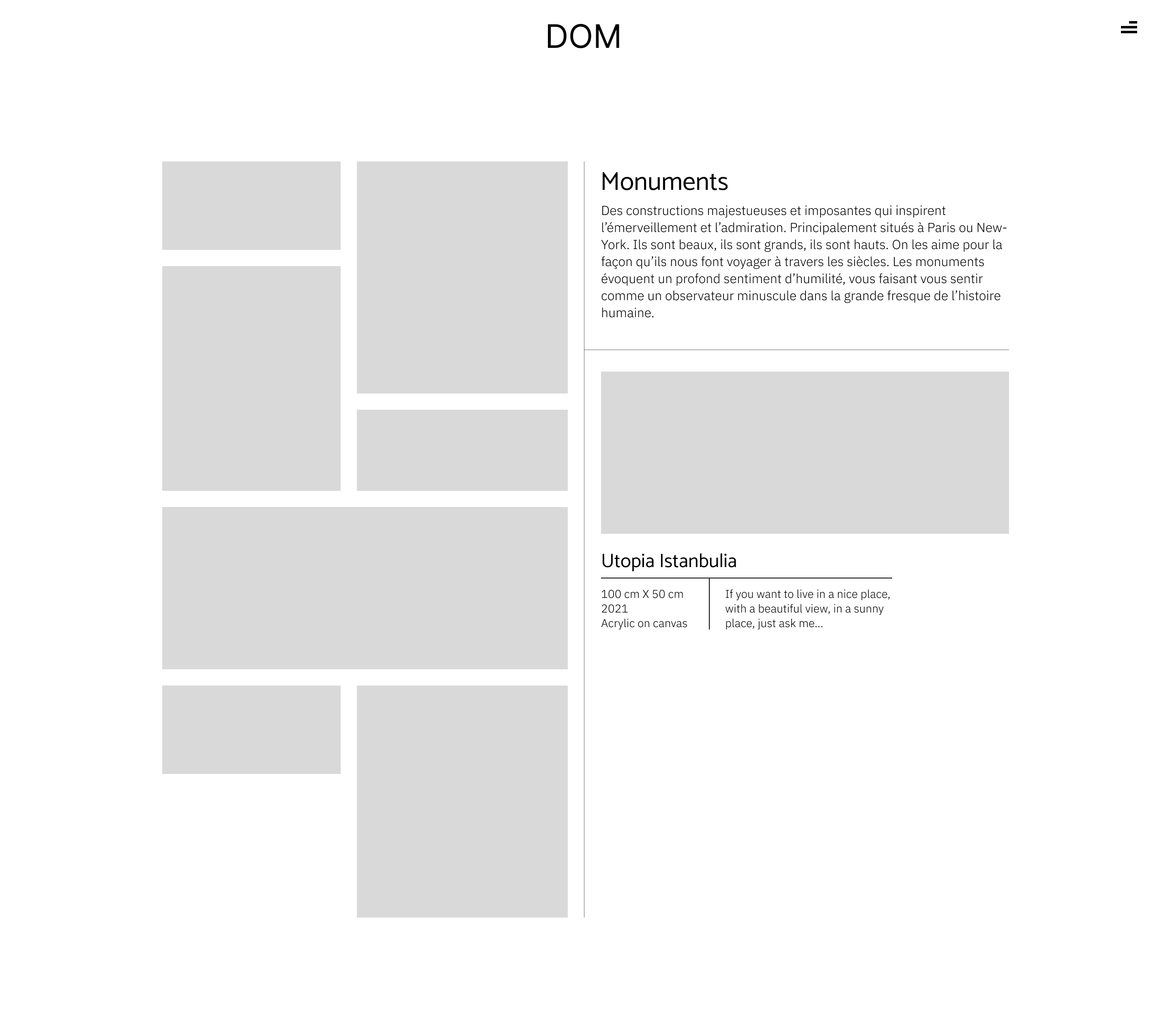
Homepage - Desktop
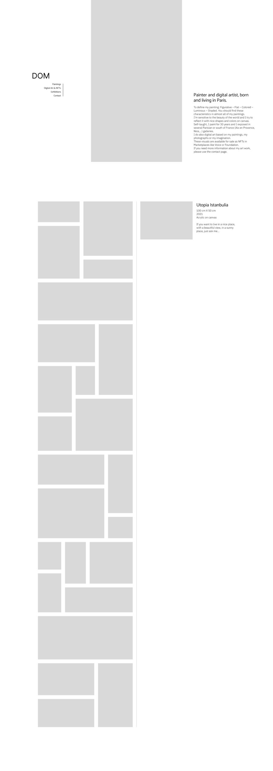
Section 1
The section is divided horizontally into three parts: the logo and navigation menu on the left, a scrolling display of artworks in the center, and the artist’s presentation on the right.
The goal is to create an original layout that places the artworks at the heart of the composition, making them the central visual focus.
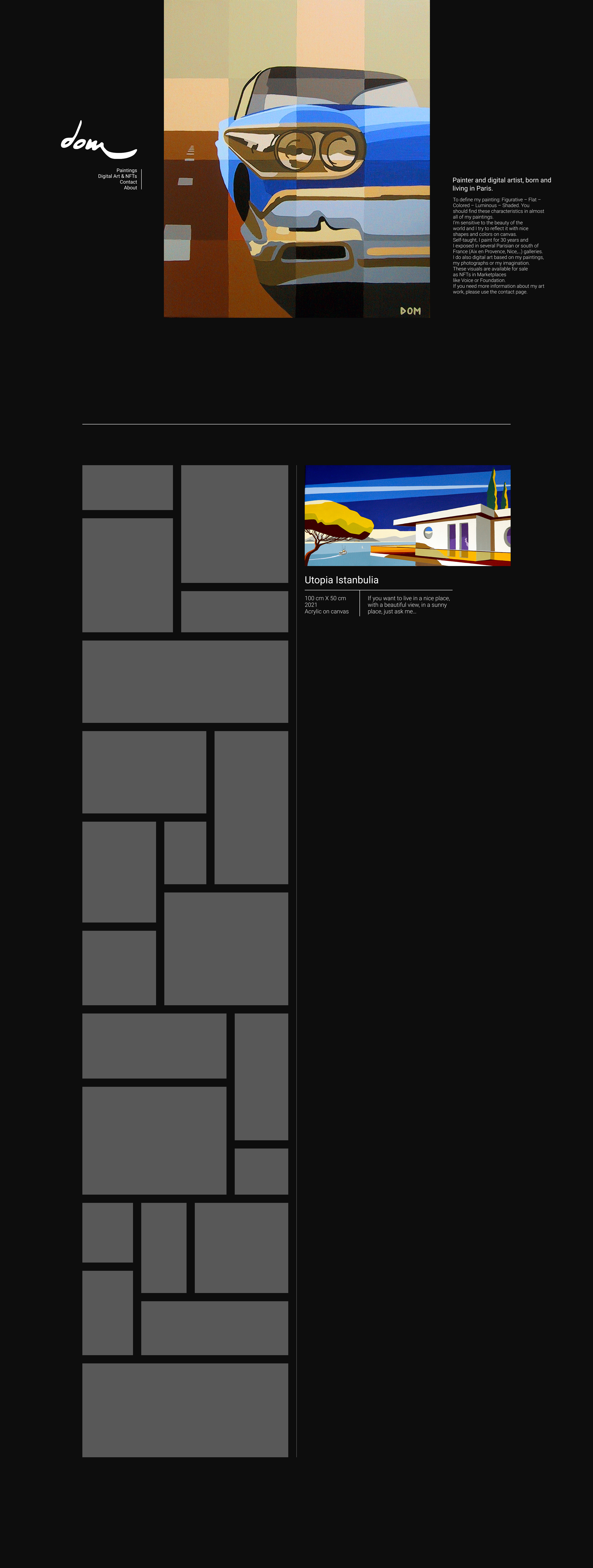
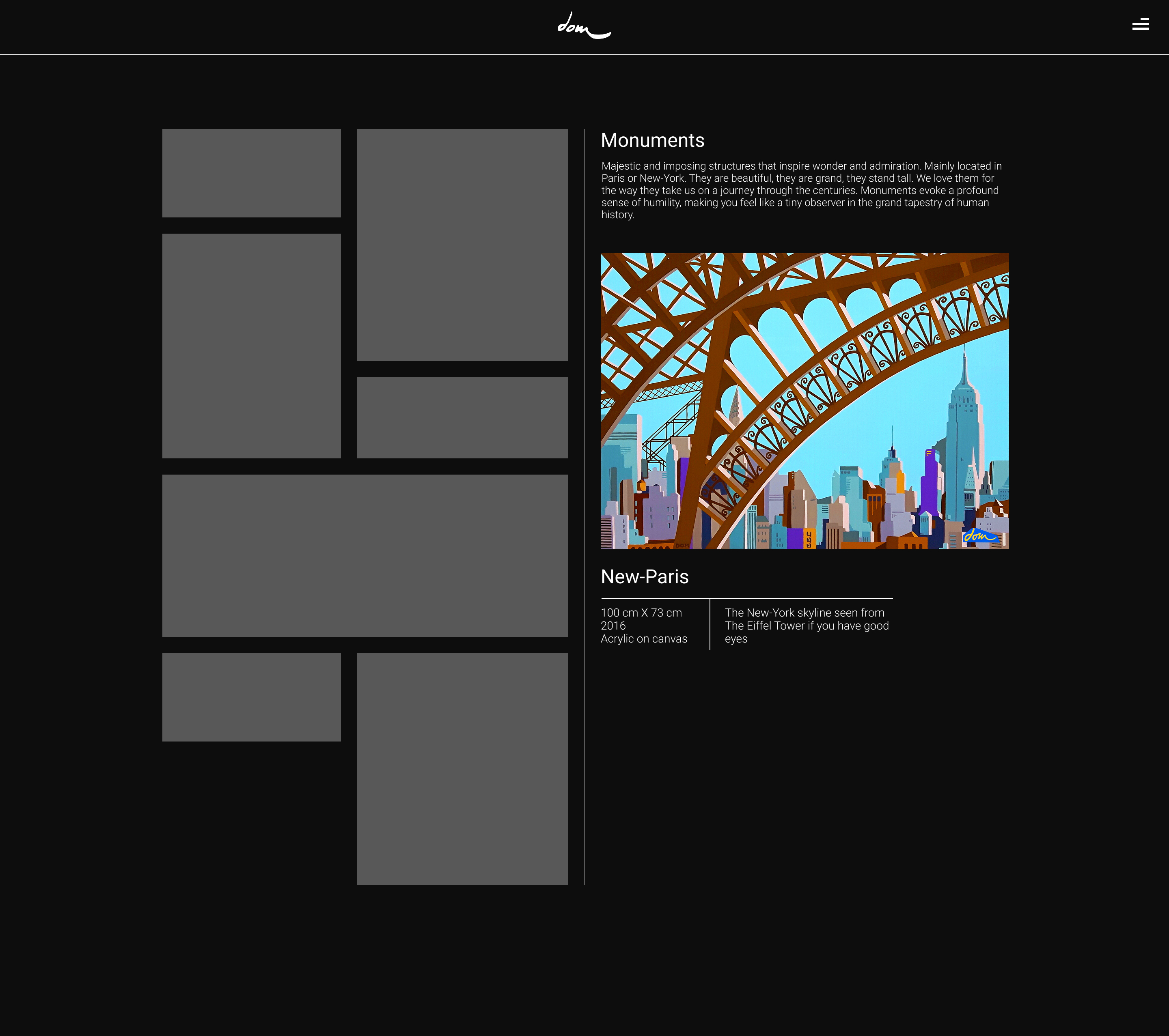
Section 2
This section is split into two equal parts (50% / 50%).
On the left, a vertically scrollable mosaic displays all of the artist’s artworks.
When an artwork is selected, it appears on the right side, showing the image of the piece along with its title, characteristics, and description.
Vertical and square artwork layout
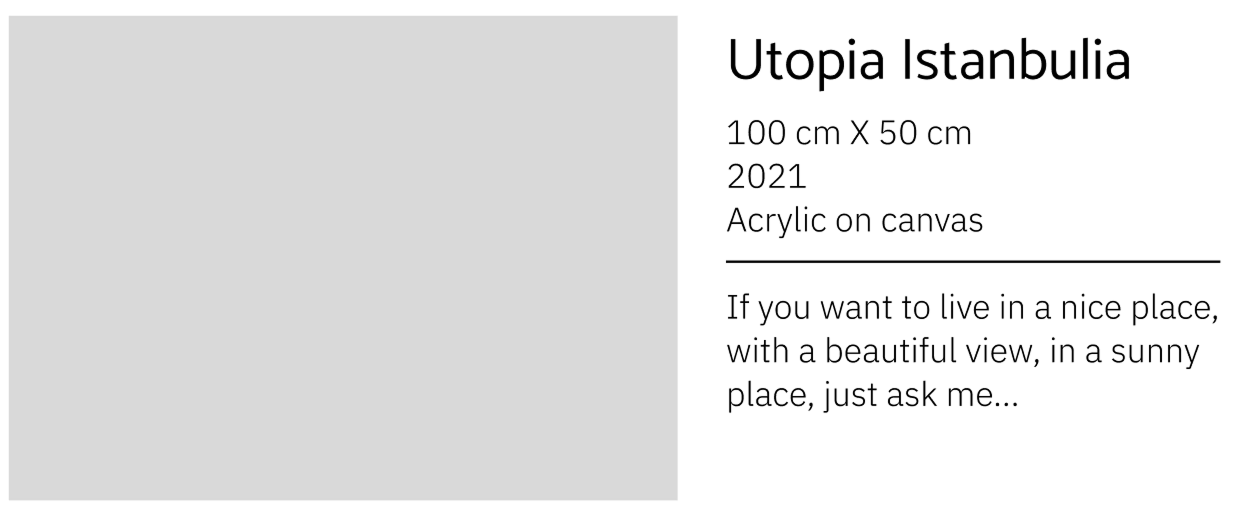
Artworks in vertical and square formats use a two-column layout, with the artwork displayed on the left and the text content on the right.
This layout is optimized to present the artwork at an appropriate size, neither too large nor too small, while keeping the accompanying text clear and easy to read.
Horizontal artwork layout
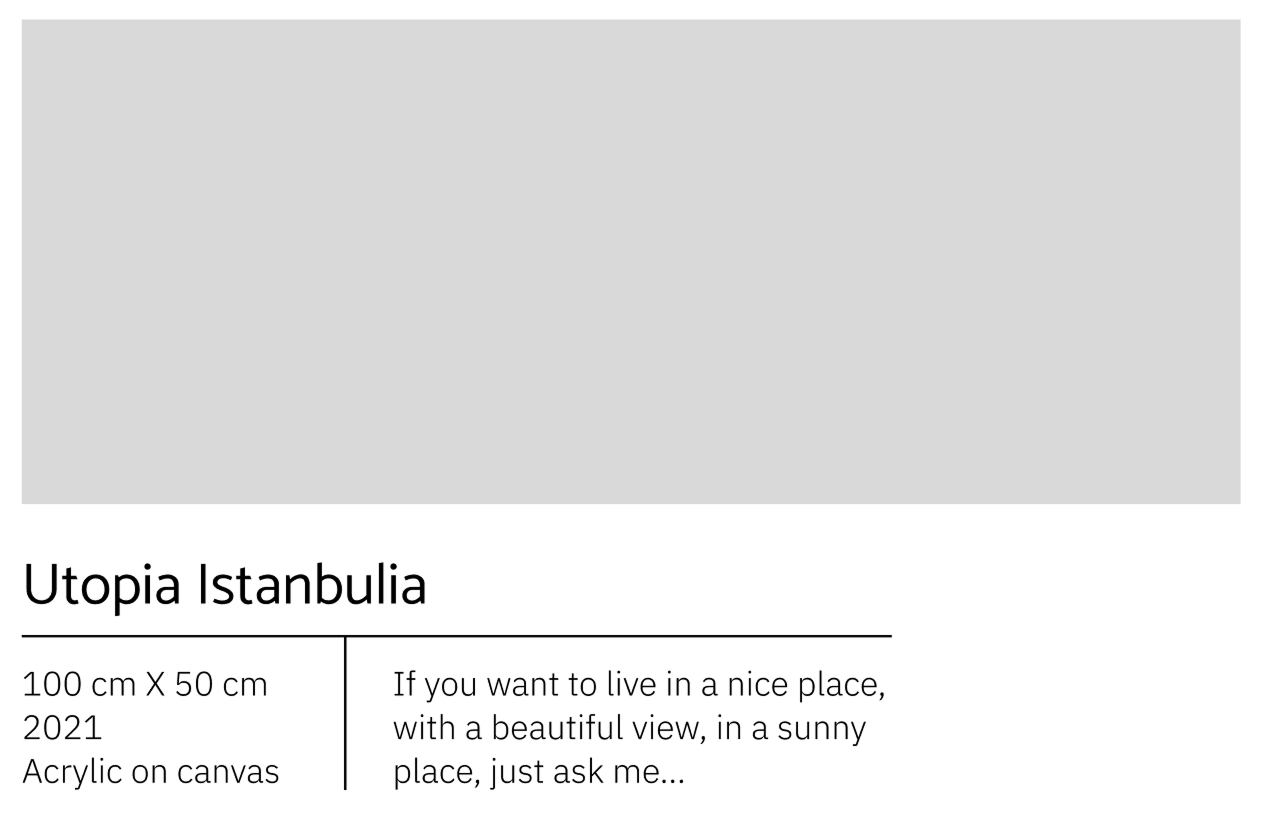
Artworks with a horizontal format use a different layout than vertical or square pieces, as they need to take full advantage of the available width.
In this case, the text block is positioned below the artwork, ensuring appropriate image sizing and optimal readability.
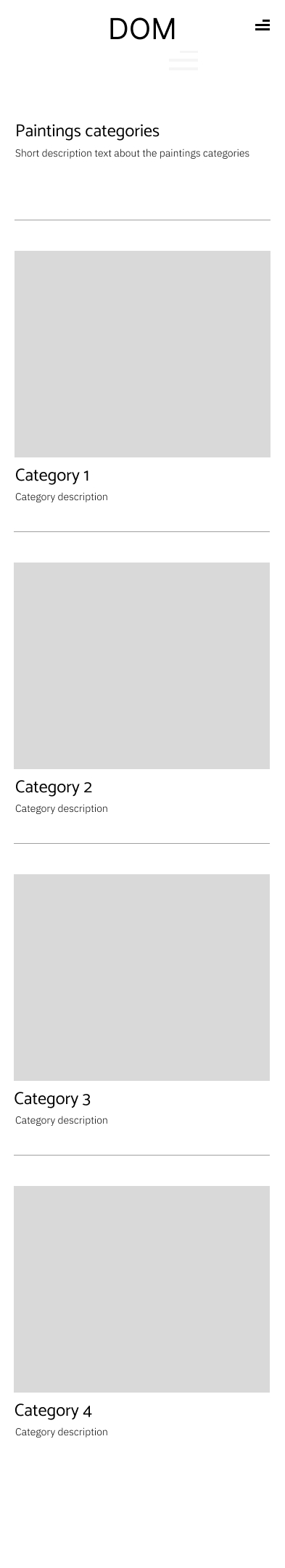
Homepage - Mobile

Section 1
This section is divided into two horizontal parts.
The first features a centrally positioned logo, while the second, located below, displays the same scrolling artwork layout used on the desktop version.
The design is purely aesthetic and minimalist, with a strong focus on showcasing the artist’s work.
Section 2
For the remainder of the page, the mosaic-based layout used on desktop cannot be effectively adapted to mobile, as it would become too small and potentially less ergonomic.
A classic vertical layout is therefore adopted, displaying previews of the artist’s works: ten artworks shown sequentially.
After the tenth artwork, a button leads to the page featuring the different artwork categories, encouraging users to continue exploring the site in a smooth and intuitive way.
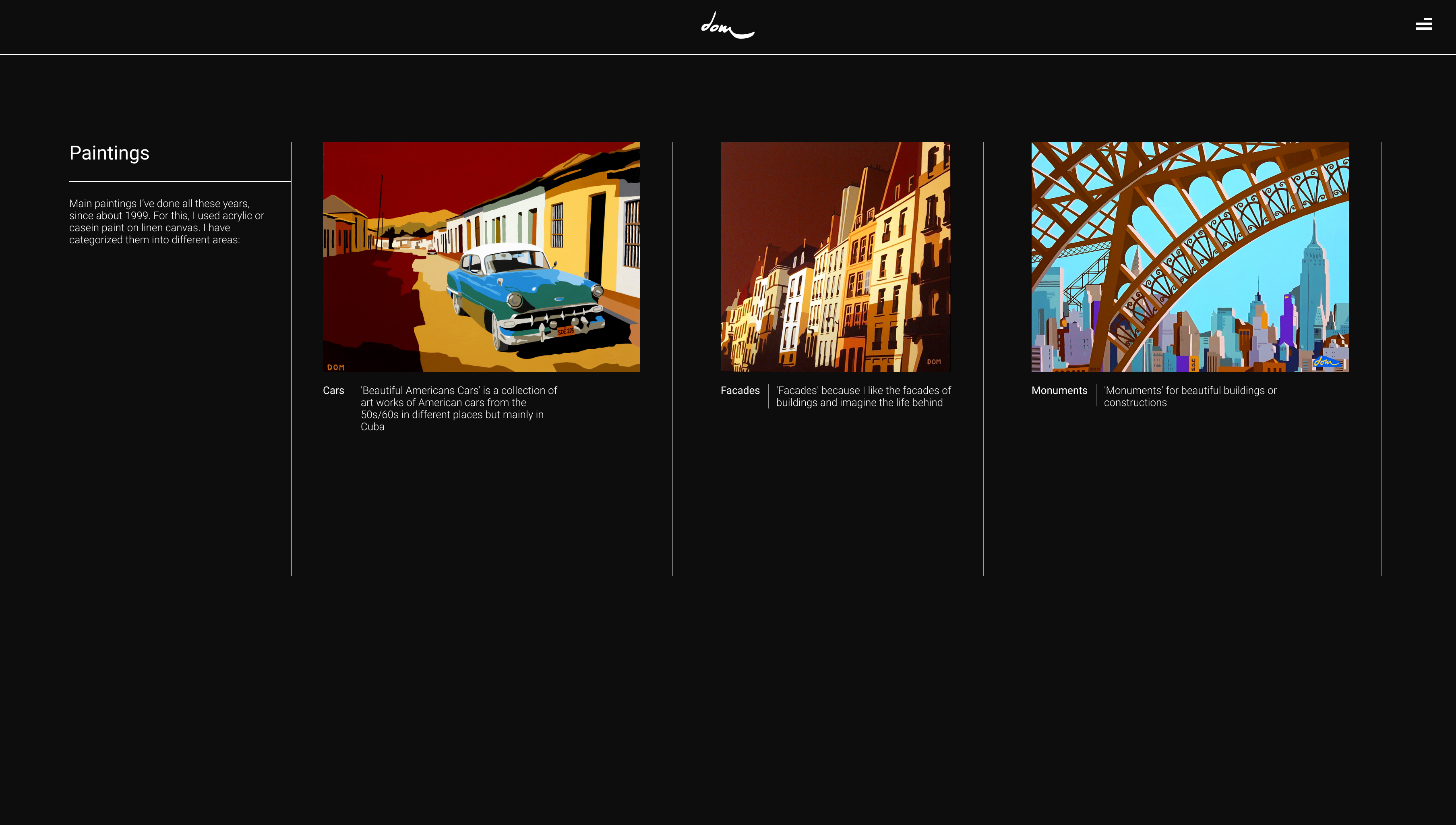
Paintings category list - Desktop
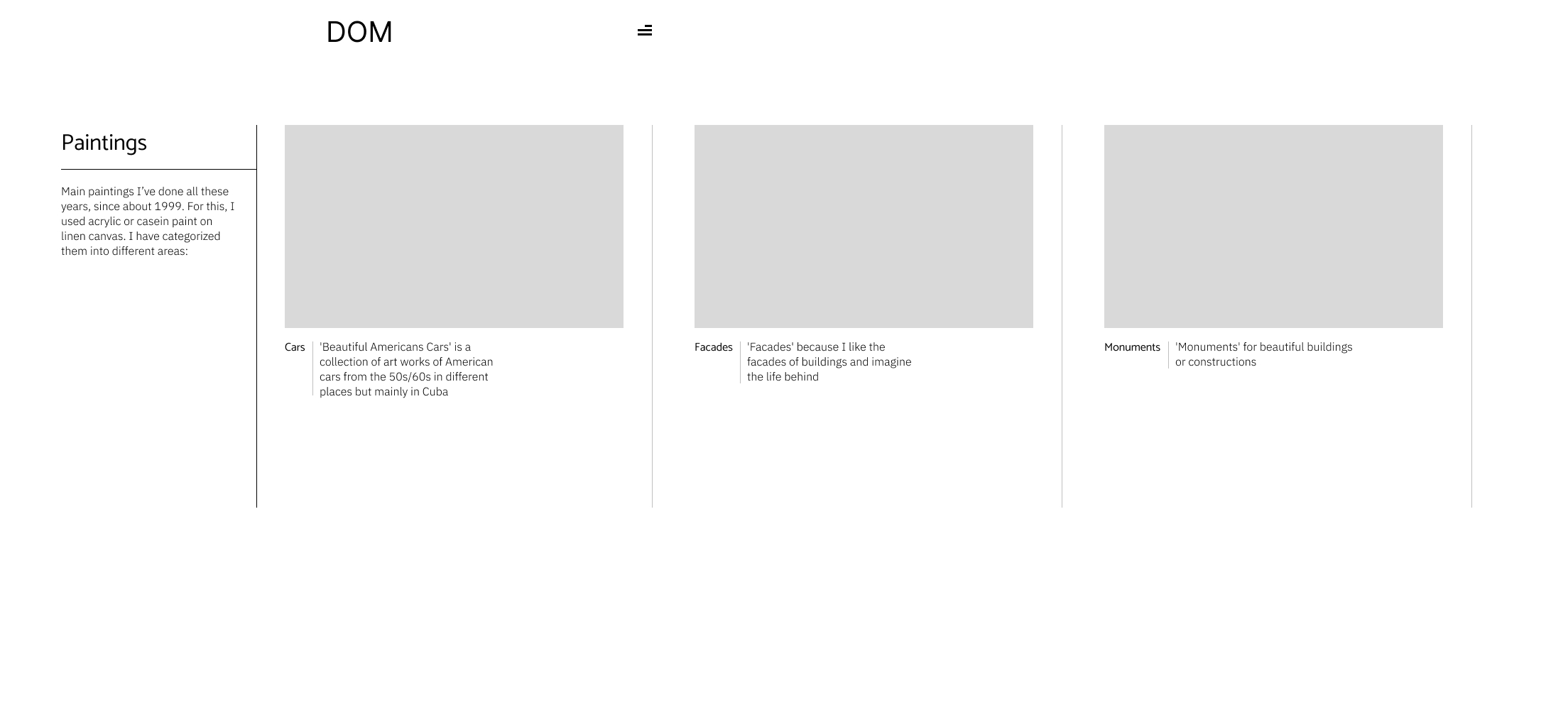
Category list template
Categories are presented in a horizontal list to break the monotony of vertical scrolling, which is already heavily used throughout the mosaic-based layouts.
This horizontal display also echoes the traditional physical experience of an art exhibition, where paintings are often viewed side by side along a wall.
Paintings category list - Mobile
Category list template – Mobile
On mobile devices, the category presentation adopts a classic vertical layout, which is better suited to smaller screens and aligns more naturally with intuitive scrolling behavior.
As on desktop, each category is represented by a representative artwork along with a short description, ensuring visual consistency across devices.
Paintings category - Desktop
Category template
The layout follows the same structure as Section 2 of the homepage, with an artwork mosaic on the left.
When an artwork is selected, it is displayed on the right along with its detailed information.
At the top of the page, the category name and a short description are also displayed, providing context for the collection.
Paintings category - Mobile
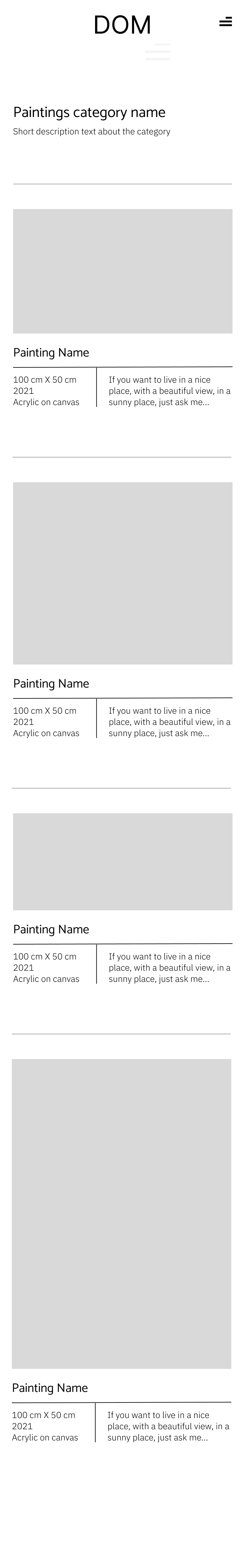
Category template – Mobile
On mobile, the layout follows the same approach as the mobile version of the category list page, using a classic vertical display.
The artworks belonging to the selected category are shown sequentially, one after another, ensuring a clear, readable, and mobile-friendly browsing experience.
Visual identity
Logo
The logo is based on the artist’s signature, as used in their most recent works.
Color scheme and contrast
The site emphasizes contrast by using a dark background to make the colors of the artworks stand out.
The overall color palette is kept very neutral: black and white only, so that the artworks remain the central focus of the design.
Typography
"Painter and digital artist, born and living in Paris"
The Roboto font is used throughout the site for its clean, neutral, and highly readable appearance.
Prototypes
Screenshots