visit the site here
libretypeindex.com is a curated catalog of free and libre fonts. A clean, fast directory designed for browsing without distractions.
The goal is simple: a clear list of fonts you can actually use, with previews, details, and direct links to the source.
Visit the website: https://libretypeindex.com/
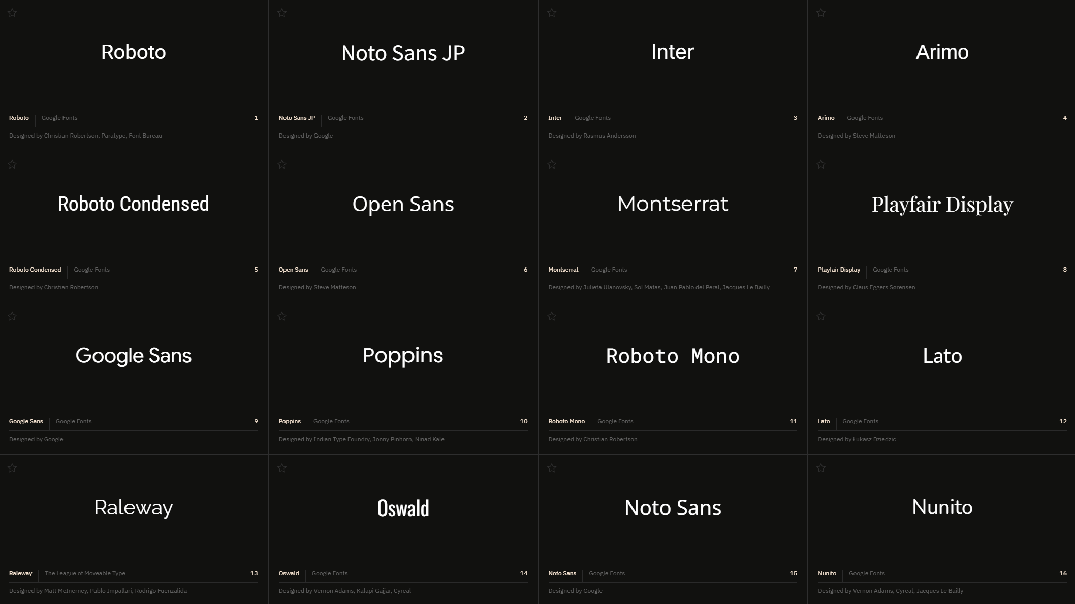
Throughout my studies and my professional work, finding the right typeface for a project has always been a challenge. Quality fonts are scattered across dozens of foundries, marketplaces, and personal websites, some free, some paid, all categorized differently, which makes it nearly impossible to compare options side by side.
I built libretypeindex.com to fix that frustration: a single place that gathers as many free and libre-licensed typefaces as possible, from a wide range of foundries, in a format that lets you scroll and actually compare them at a glance.
The site runs on WordPress with a custom theme. The technical implementation was developed with the help of AI (Claude), while the curation, design, and editorial direction are mine.
uninterrupted browsing & neutral interface
The font grid uses continuous infinite scroll to keep browsing as fluid as possible, no page reloads breaking the user’s search flow. On mobile, this shifts to a paginated list: endless scroll through hundreds of fonts felt disorienting on a small screen, so pagination gives users a clearer sense of where they are.
Clicking a font opens a detailed preview; a single « back » click returns the user exactly where they left off in the grid, keeping navigation seamless.
Users can also replace the font name shown in each card with their own words (a brand name, a phrase) to preview their actual text in every typeface while scrolling.
The UI is intentionally neutral and clean. libretypeindex is a tool for searching and comparing fonts, so the interface gives the typefaces themselves as much room as possible. Dark mode was an obvious choice, research sessions can run long, and a light interface would become visually tiring over time. The dark grey and beige palette was chosen for a soft, low-fatigue contrast.
search as the core
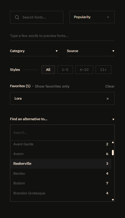
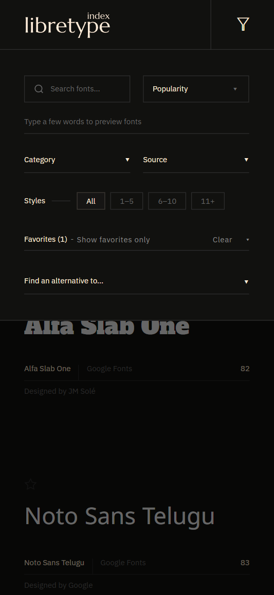
Search and filtering is arguably the most important part of the site. Users need solid search tools for the experience to be genuinely useful, beyond simply scrolling through hundreds of fonts. Several tools are available: manual search, filters by category, source, and number of styles, and an « alternative finder » that surfaces free, libre-licensed fonts close to well-known but costly commercial typefaces. The goal is to give users as many entry points as possible to find their ideal font quickly and easily.
a detailed preview
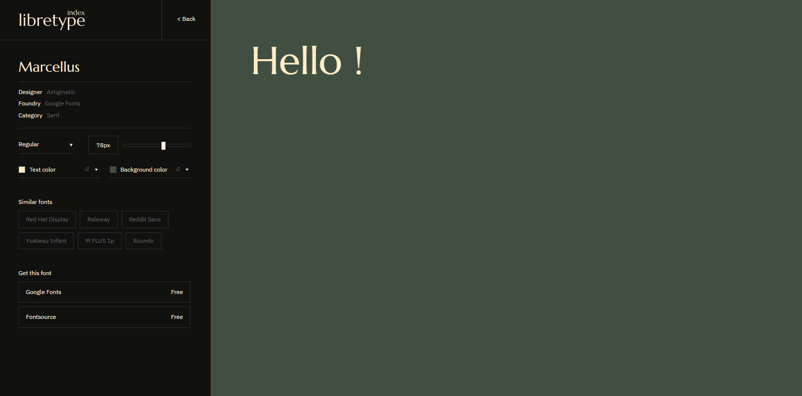
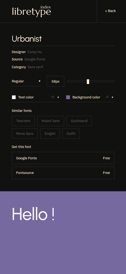
Clicking a font in the grid opens a detailed preview with all relevant information (source, designer, category) alongside a preview tool that lets users test the typeface and style the typography: font weight, size, text and background color. This lets them picture the font in their own context.
Users are also shown six fonts from the catalog closest to the selected one, with similarity computed by AI across every typeface on the site.
Finally, links to the original sources let users download the font.
a favorite system
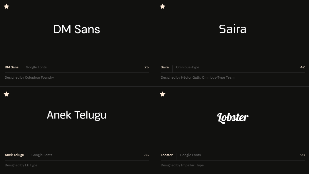
A favorites system lets users save the fonts they like with a single click. Whenever they want, users can switch to a dedicated grid showing only their favorites, making it easy to compare their shortlisted typefaces side by side.
mobile layout
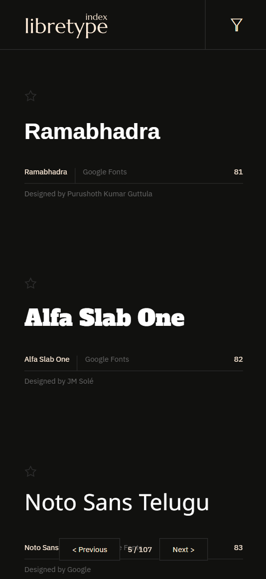
libretypeindex was designed for desktop use, and the font grid couldn’t realistically be carried over to mobile as-is. The mobile version instead moves to a more conventional display, one font after another, in a vertical list. For usability, a pagination system was necessary, giving users a clearer sense of where they are within the list of fonts. Continuous scrolling is affected as a result, but this trade-off was necessary.
The search and filter tools are moved into a standard mobile menu. The font preview interface is reproduced as faithfully as possible to the desktop version, all the information, the tools, and the customizable section included.
The goal of the mobile version was to stay as close as possible to the desktop experience, preserving a consistent overall identity, while rethinking the layout, ergonomics, and navigation so they’re as well-suited to mobile as possible.
The catalog includes 2136 typefaces, all distributed under permissive licenses (SIL Open Font License, Apache, etc.). Most are delivered via the Bunny Fonts CDN; a smaller selection is hosted directly. All fonts remain the property of their original authors and are subject to their respective licenses.